
TRENDPREP INDICATOR
One of the key challenges surrounding trend following is that it is reactive in nature. This is the same for all trend indicators. There must be a passage of time and a movement against the ‘current’ trend direction before it is possible to recognise that a directional change may be validated. Having confidence in trend direction is critical for success, so it is key to ensure that the method used is simple, easy to visualise and act upon. The cost associated with erroneous trend recognition can be significant, so it naturally follows that the avoidance of ‘false signals’ is key i.e., current trends which may be recognised but then quickly revert to the original trend, thereby inducing costs for false entry and exit trades. It is important to try to identify only those trends which have strong validity.
For this task, we use our proprietary TrendPrep Indicator – a simple example can be seen in the graph below. The purpose of this indicator is to minimise noise, clearly identify the current bias, and eventually the status of the current trend, and what might constitute the formation of a new trend. This indicator features regularly throughout this website to explain where points of least resistance may be. Unlike many indicators, it does not have a look back period, but instead uses volatility to determine the next point in the indicator series. There are no parameters used, so the indicator is consistent throughout and can be used on any financial instrument to determine general trends.
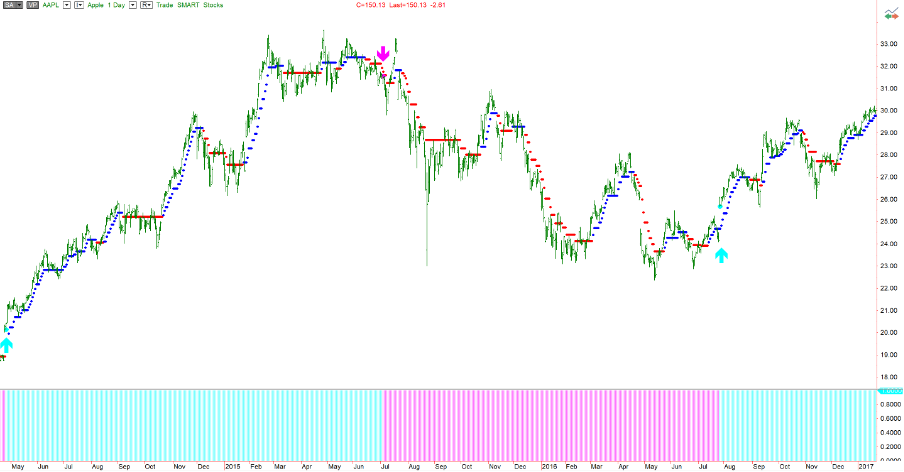
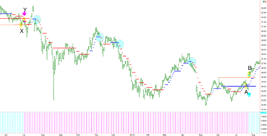
This chart shows several trends and sub-trends in play. Some are positive (Blue dots), and some negative (Red dots). I have added, for the sake of visuals, some coloured arrows which indicate trend changes as prescribed by the TrendPrep indicator’s most basic logic. Though it must be said, this is one of many different uses and some will be explored in subsequent articles. Using these red and blue dots, it is now possible to confirm the point at which a trend may have been deemed to have changed.
CONFIRMATION POINTS
One of the several ways to recognise a potential trend change from negative to positive using the TrendPrep indicator requires two things to fully validate the transition.
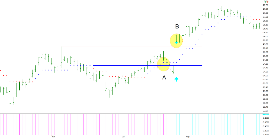
This graph above zooms in on the last positive confirmation point of the prior graph. The solid blue line is simply a manually drawn continuation of the blue dotted lines which represented the last positive direction segment and was the highest point, before the red dots appeared (Negative direction). The first requirement for a confirmation point is that the current positive direction segment should exceed the previous one. This consists of any series of continuous blue dots. At point ‘A,’ the blue dots rise above the blue line (manual) which represented the high point of the previous positive segment, satisfying the initial requirement for confirmation.
The other requirement for confirmation purposes with this method, is that the actual asset price exceeds the highest price within the previous positive direction segment. The orange line drawn (manual) represents this previous highest price point. At the place marked ‘B,’ the current price exceeds this value. Once both above have been achieved the positive trend is confirmed. In this example, it can be confirmed by the small blue cross which appears at the bottom of that bar, as well as the histogram beneath turning blue.
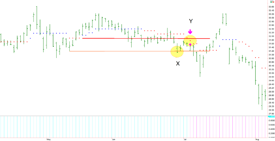
The exact opposite is true for negative trend confirmation. In the above example, the red solid line (manual) from the previous negative bias segment has been drawn in. The lowest actual price point from the previous negative segment is represented by the orange line (manual). In this example, both criteria are met for negative trend confirmation but, unlike the previous example, they occur in different orders. At point ‘X,’ the price in the current negative bias segment exceeds the low of the previous. And then at point ‘Y,’ the indicator itself goes lower than the previous negative segment’s lowest indicator level (represented by the manual red solid line). This confirms the negative trend in full.
CONTINUATION POINTS
Once a trend is confirmed, it is important to maximise the profit potential. Within the trend, there will often be other points worthy of note. Sometimes, it may seem that a trend is losing energy only for it to suddenly reignite with considerable strength. These are Trend Continuation Points.
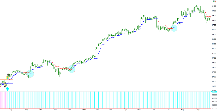
In the above graph, we can see a positive trend confirmation occur at point ‘B,’ consistent with the previous explanation regarding trend confirmation. This trend remains intact for the remainder of this period as demonstrated by the blue histogram below. However, there are many segment changes from positive to negative and vice versa. Within a positive trend, the points at which and negative trend segment changes to a positive trend segment (where red dots change to blue dots) is a positive continuation. These points can often be powerful indicators of continued movement in the direction of the current primary trend.
Naturally, the same is true in negative trends. Within the broader negative trend of the above graph, you will see numerous opportunities where shorting may have been advantageous. Again, the negative trend is confirmed at point ‘Y’ and continues in a downward trajectory. The blue circles indicate, within this trend, points at which a new negative bias or continuations are confirmed by the dots changing from blue to red. Of course, the above explanations are used for demonstration purposes only. As with any other indicator, there will be times where things do not conform. Sometimes further validation may be required. There are many ways this simple trend recognition logic can be used, either via the use of technical (visual) analysis, or by statistical means which will be discussed at a later stage.
TRENDLINES and TRENDPREP
There are times when trends are so strong and robust that there are no reference points available to allow trend confirmation, or other. This is problematic when trying to identify changes in trend and requires a different visual form of recognition.
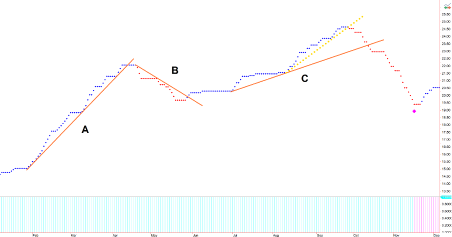
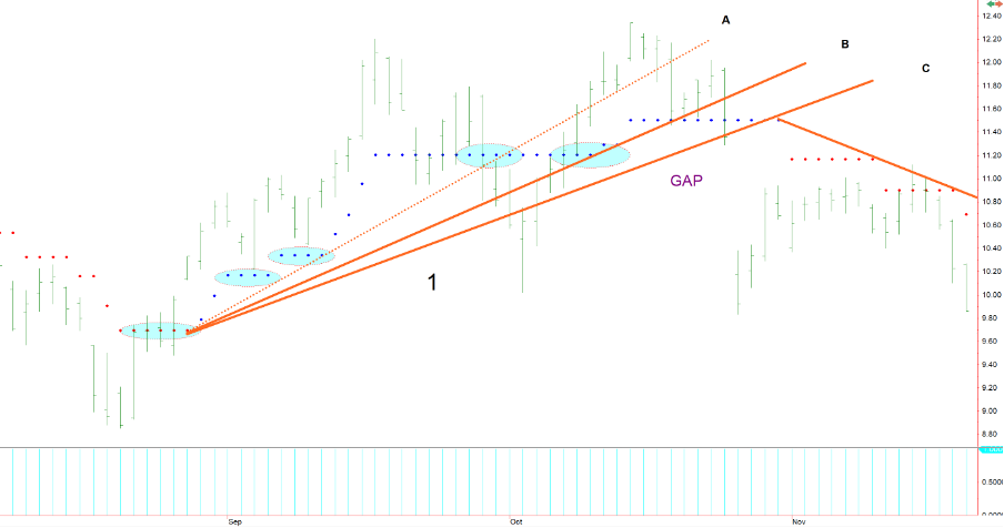
In the graph above, the price data has been stripped away and all that remains is the data of the TrendPrep indicator. The nature of trend ‘A’ is such that the stock price has risen dramatically with no negative interruption. There can be no negative trend confirmation with no reference point using the indicator in isolation as previously discussed in the section ‘Confirmation Points,’ therefore one effective method is the use of trend lines to acknowledge potential changes in trend. A trend line is manually drawn touching several points within the indicator series and when broken this may represent either a potential exit point, or even a trend turning point.
As the above is a confirmed positive trend, represented by the blue histogram, the trend line for trend ‘B,’ when broken to the upside, represents a validation of the trend continuation which occurs when the blue dot appears. Trend ‘C’ similarly has few reference points and when the trend line indicates a trend break there can be no TrendPrep negative confirmation. I have added a small sub-trend with yellow dotted lines above trend ‘C’ to indicate a potential earlier exit or trend change point. Please note the point on the histogram at the bottom of the page where the negative trend confirmation is eventually verified. Without the use of trend lines, it would be often difficult to acknowledge a trend change with the indicator alone, especially when the preceding trend is without interruption. The clear nature of the trends makes the indicator invaluable and suitable to trend line use as it lacks the noise sometimes associated with the primary data.
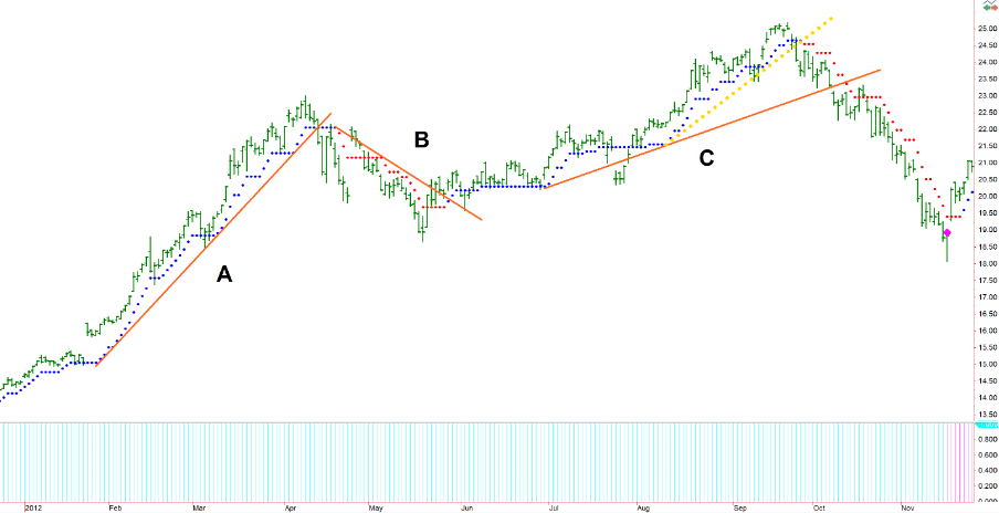
This is how things look once the data is reinstated. Graphs such as these may appear throughout the site identifying and informing of trends where there is a higher possibility of an upcoming directional change.
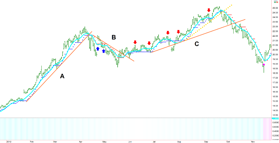
To emphasize the point relating to the need to eliminate false signals, some arrows have been added to the above graph. The light blue line is a 9-day moving average of the closing price. This number has been used partly because it follows the price data in similar fashion to the TrendPrep indicator, as well as it also being the default setting within the software used. Like the TrendPrep indicator, the same logic is used to define direction of the moving average (higher than previous bar = positive, lower than previous bar = negative)
As you will see, the moving average is exceptionally smooth throughout trend ‘A,’ providing no potential false signals. However, in downward segment ‘B,’ this moving average turned up twice (Blue arrows). Two ‘false’ signals would negate any potential profit from identifying the trade in the first place. Finally, within trend ‘C’ there are multiple potential ‘false’ signals or identifiers highlighted by the Red Arrows where the moving average turns down during a strong upward segment.
Guidelines and Practicality
Considering the subjectivity associated with technical analysis, and more-so trend lines, and particularly when the actual price data is very noisy, the use of trend lines on the indicator can help to provide some directional confidence. The purpose of this indicator is to create some order and understanding of the trend by reducing the noise associated with the price data, and to recognize potential turning points.
Although the TrendPrep indicator is generic in nature and can be applied to any security or data series, there are a couple of things worth noting. Firstly, only trade very liquid assets e.g., indices, blue chip equities, FX etc. The more liquid the asset, the less noisy the price data will tend to be, thereby making the timing process potentially easier. Secondly, if you view a chart and, for whatever reason, you cannot decide what to do next, then do not trade that instrument for now, or at least until things become clearer. There are so many liquid instruments that can be traded that, when unsure about a course of action, it is best just to leave things alone and move on to something else. There are some occasions when the action you do not take is more important than the action you do.
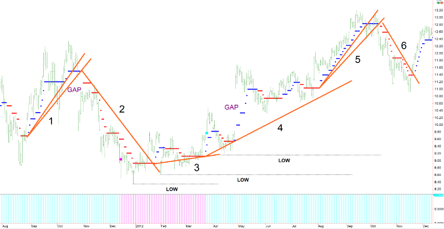
For the example above, the price bars are slightly in the background, so the indicator and trend lines become more visible. All the lines drawn are touching the indicator values and are really to compliment the standard indicator logic of ‘confirmation and continuation,’ and sharpen the timing as discussed above. Theoretically, this logic could be used in isolation, however, I prefer the validation that a combined process encourages. Let us look at each part of the trend.
1) Firstly, you will see that trend line ‘1’ has two lines drawn. This is like trend line ‘5’ for similar reasons. Trend lines can be drawn combining red and blue dots, or just one colour. Importantly, trend lines can only be drawn where a succession of dots that appear at the same level (In this case 4 successive dots have been chosen). I have enlarged trend line ‘1’ below to demonstrate.
Based on this rule, I have highlighted rows of four dots or more which could be considered as anchors for a trend line. The drawing of a trend line using this indicator is a progressive process. Trend line ‘C’ is the eventual trend line used as it represents the last point before the bias switches (Red dot). However, trend line ‘A’ would have been a predecessor as it touches relevant areas where there are four dots at an equal level. When the line is eventually broken, if the dots remained blue, the line is simply redrawn touching the last dot in the series until either the blue dots go higher, or the red dot changes the trend. This is why line ‘B’ and ‘C’ have been drawn. In fact, the lines could have been redrawn more times as the indicator moves sideways.
- Now let us look at trend line ‘2.’
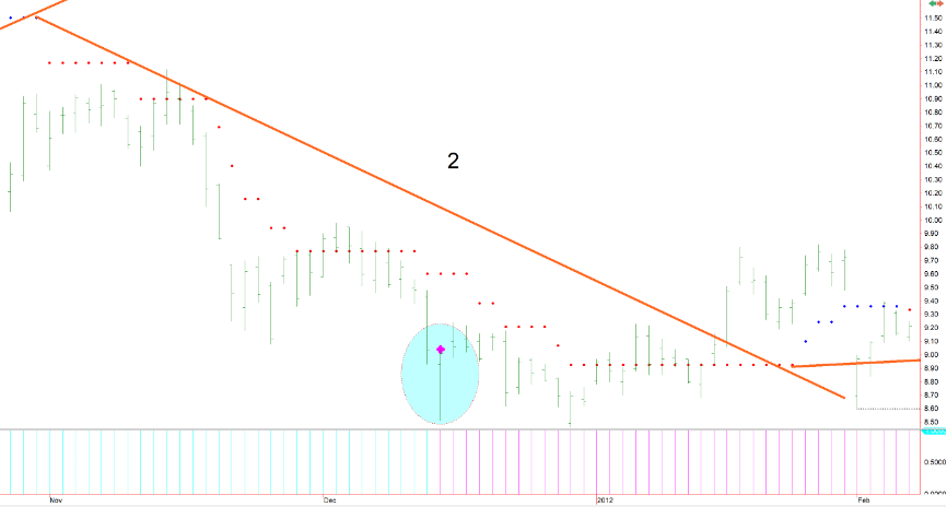
Following the break of the first trend line, trend line ‘2’ is eventually and progressively drawn. It should be noted, that the TrendPrep negative confirmation did not occur, due to lack of reference points, until late in this downward move. This can be seen highlighted in the blue ellipse. This demonstrates why trend lines can be highly complementary to this process, sometimes signalling trends in advance which have not necessarily been initially recognised by the basic TrendPrep logic.
3) Trend lines ‘3’ and ‘4’ are drawn following the same progressive process.
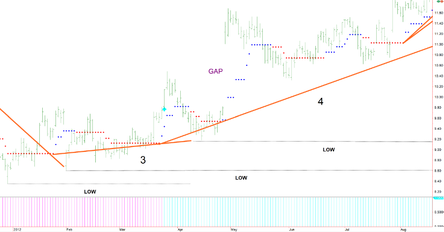
4) Trend lines 3 and 4 (above), having never been breached, remained effectively as support areas throughout this period. Black ‘low’ lines have been drawn which may be used as areas for potential stops. At the beginning of trend line ‘4’, the histogram shows that the trend becomes positive. Within this uptrend, there are several times where the dots turned from red to blue, indicating trend continuation i.e., Potential opportunities for further gain, emphasizing how the trend line process compliments the primary logic.
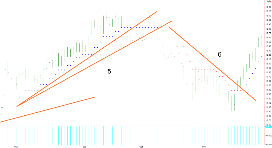
Trend line ‘5’ shows the standard progression and eventual final drawing, as does trend line ‘6’.
Regarding the topic of practicality, it may sometimes be useful to translate the trend lines drawn using the indicator directly on to the actual price data. This can help as an additional confirmatory process.
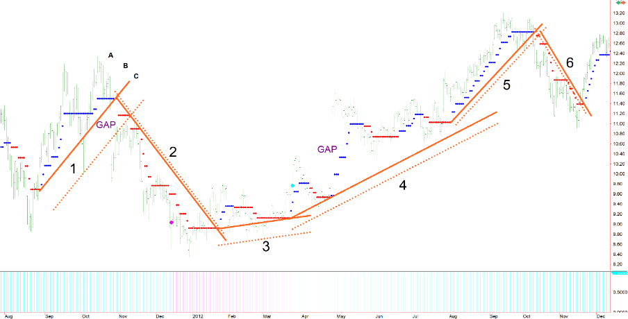
Each of the above trend lines has been copied and then applied to the price data. This allows us to create significant levels which might represent trend turning points using the price data alone. The copied lines are moved to the nearest point of ‘support’ or ‘resistance’ within the price series, and parallel with the original indicator line. These price data trend lines are shown as dotted lines beneath or above the indicator lines. This allows the user to replicate and specify actual price levels of interest, as opposed to indicator levels.
In the graphs above, you may also notice where the word ‘Gap’ has been entered. For now, suffice to say that these are extremely dangerous and unpredictable areas to trade in, but more of that in a later post.
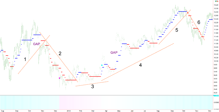
For visual purposes, once all the indicator lines are stripped away, the graph looks like this (above).
To conclude, the TrendPrep indicator is one which is simple to visualise and apply. It recognises trends efficiently and stays with them when other indicators might falter. Like most visual aids it is not perfect, however, it will identify all major trends, continuation points within those trends and is easy to monitor. The addition of Trend Line validation adds to the indicator’s stability. It is important to remember that, unlike statistically driven strategies, TrendPrep and trend lines are indicators and, as such, can be open to interpretation which can sometimes be more than challenging. There are ways, however, to minimize even these inconsistencies with some degree of simplicity.
The next subject relating to timeframes goes further to discuss how to ensure that there can be confidence in the trend identification process.