
THROUGH THE TIMEFRAMES
The previous topic demonstrated how visual aids and indicators can help the decision-making process specifically when trying to determine trend direction and change. Of course, there are naturally challenges with any trend finding methodology when markets are not trending. This can lead to periods where the concepts relating to trend recognition can be confusing, and doing the complete opposite may appear to be a suitable course of action.
We have seen how some form of validation, using the example of trend lines, can solidify this process. Further validation may sometimes be required. One simple methodology that presents itself is the use of time frame validation. In simple terms, this practically means referring to different timeframes to add additional confidence that the directional decision being made can be followed with increased confidence. Even where the markets are trending satisfactorily, additional opportunity may be offered within the primary trend.
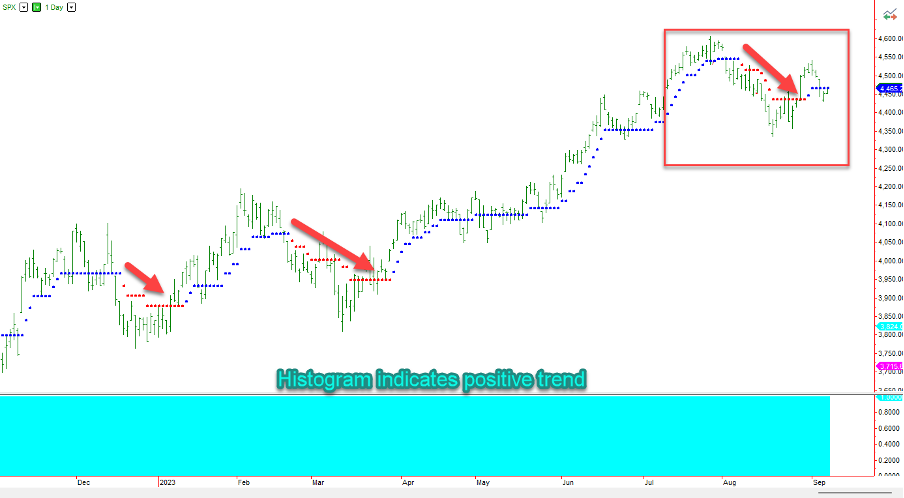
Considering the TrendPrep logic discussed in the previous piece, and the stated emphasis on focusing attentions on liquidity, I have posted a simple graph of the S&P 500 movement from the fall of 2022 through to the fall of 2023. As the histogram at the bottom suggests, the broader trend is positive throughout. This is simply because there are no ‘lower lows’ of the indicator posted throughout this period. There have been three periods where the market has trended lower in the short term, but the larger trend remained positive. The natural question is whether these short-term movements against the trend can or should be traded to maximize gain. This is the decision of the person trading but, if we effectively focus in, things may on occasion become more apparent. The easiest way to do this is to move down the timeframes to get a clearer view. In the graph below, a 30-minute graph is used, focusing on the activity of latter period of the graph above highlighted within the red box.
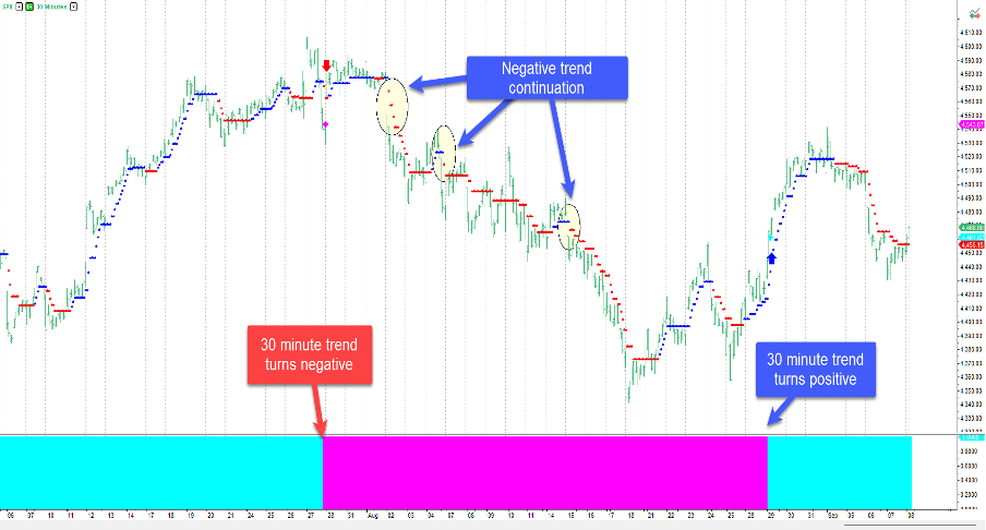
As can be seen, with the shorter timeframe view, not only was the downward leg sufficient to generate a positive return from the point where the shorter-term downward trend was confirmed, but there were also several points within the negative bias created where a trend continuation has been highlighted. This all amounts to additional opportunity. When the Bias histogram turns blue again (in line with the primary direction of the Daily chart above), the 30-minute graph is effectively validating the primary trend. As with all indicators, perfection is impossible but, using something that is concise, logical, and easy to monitor will certainly aid the decision-making process. There can be trends within trends which are easily identifiable and times where none is apparent. Whether you are trading or investing, it pays to limit participation when things are less transparent. Using different timeframes for validation can be enormously powerful and will invariably assist in clarifying the bigger picture.