
SUM OF THE PARTS
Naturally, it is easier to look at things retrospectively and see what could have been achieved, but observation and understanding are all that is available when using technical analysis. Although later sections will focus on automated trading tools which takes the emotion out of trading or investing, the visualization of a situation is important for validation and can be used on a standalone basis to significant effect, as well as providing complimentary agreement with strategies that are purely statistical in nature. If what you see is difficult to understand, or indeed does not point firmly in any given direction, then avoid getting involved and move on to something else with greater certainty. Another index, another stock, or whatever.
Using the same S&P 500 graph before, and using some of the previous topics discussed, it may be useful to walk through this specific graph to highlight observations. We will break it down into parts.
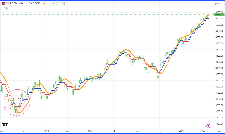
The period from September 2022 to November 2022 is highlighted with a red circle in this graph. We will use this as the starting point and expand the graphs where necessary to better illustrate some of the points from preceding articles.
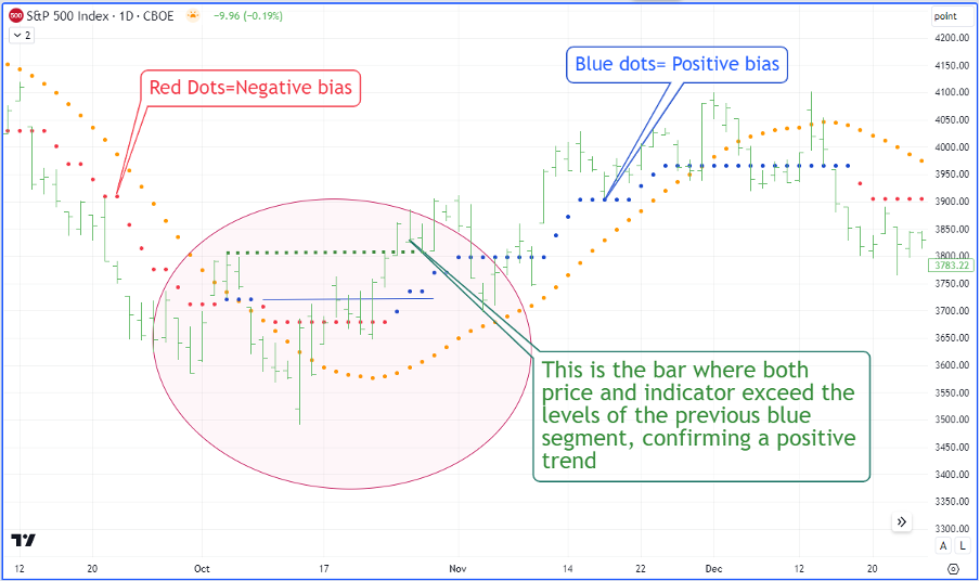
As can be seen in the expanded graph above, when the basic TrendPrep logic is applied, the target is to achieve both new price highs and new indicator highs from the previous period when the TrendPrep Indicator was positive (blue dots). That indicates that, for the time being at least, the directional preference is for higher prices. The blue drawn extended line in the ellipse is the previous indicator high, and the green dotted line is the previous price high during the last positive bias phase. Once both are broken to the upside, the greater trend is deemed positive. Note too, the orange TrendPrep Average turns higher at the same point giving further confidence in the new direction.
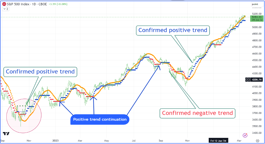
In the next graph (above) I have annotated each trend change using the basic TrendPrep Indicator logic. For the sake of explanation, within the initial positive trend, I have added a note pointing to three separate occasions, within this trend, where the TrendPrep Indicator’s bias changed from negative to positive (red to blue). These arrows point to ‘Trend continuations,’ which have been explained in a previous article. They ordinarily make particularly good entry points for additional entries or re-entries.
It is worth noting that the third and longest arrow points to a positive continuation which certainly would not have generated anything profitable. What is most interesting about this specific point is that, unlike the other 2 continuation points, the TrendPrep Average (Orange line) was facing in the opposite direction to the trend and never turned upward. In other words, the indicator was not verified by the TrendPrep Average indicator. Let us investigate this concept in a little more detail.
Verifying trends with TrendPrep Indicator and TrendPrep Averages
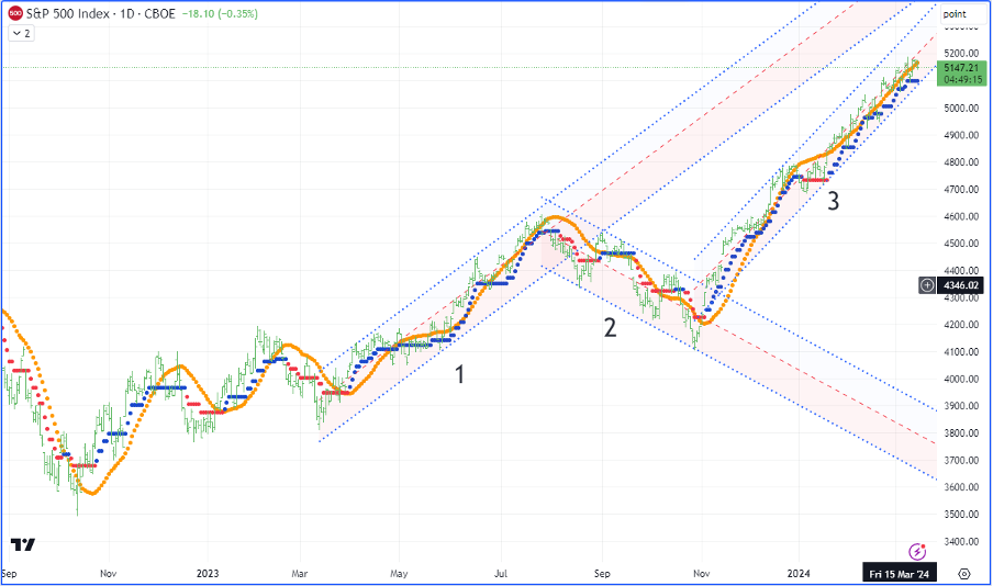
Deleting most of the previous annotations and using the simple concept of the directional agreement between indicators, it is possible to have an additional layer of verification that a trend exists. When the TrendPrep Indicator and TrendPrep Average face in the same direction, we can take that direction and create channels to the point at which both indicators change to the opposite direction. Breaking down the graph above, there were straightforward ways to know when the reliability of the current trend was becoming uncertain. Looking at each of the above examples and classifying a trend as lasting, at least 66 days (The default length of the TrendPrep Average) we can deduce as follows.
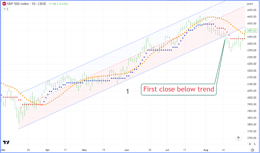
This show ‘Trend 1’- The trend length is >3 months. Both indicators confirm the positive direction. The Linear regression channel is drawn from the lowest point prior to the positive trend and heads to the highest point within the positive trend. The line is then just extended and standard error / deviation lines at the point where at least one bar is touched on either side of the central regression line. Once the channel is broken, a downward trend takes over.
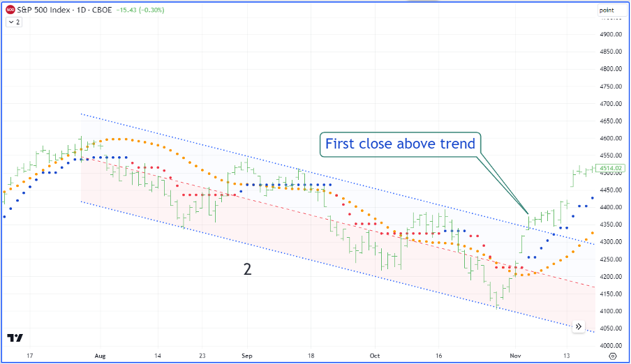
This graph above shows ‘Trend 2’ – Again, the trend is >3 months, the indicators confirm direction (by never both going against the trend simultaneously) and the Linear regression is drawn from the highest point prior to the trend recognition, and to the lowest point within the current down trend. Just as with the previous example, a break of the trend provides the platform for an enormous rally.
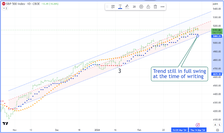
The above graph shows ‘Trend 3’ – Again, all the same criteria apply as in the previous examples. At the time of writing, the trend has extended ~25% and there is currently no reason to sell.
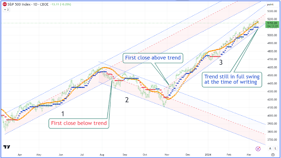
When all regression trends are combined, the graph looks like this (above). Trends have been readily defined using few indicators with some reliability. As previously alluded to in other sections, there are a couple of things to remember. Firstly, always trade very liquid instruments. This reduces noise in the price data and makes validation of new trends much more dependable. Secondly, when not sure whether a new trend has formed, move down the time frames to see if the picture becomes clearer. I would suggest a 30-minute time frame when analysing daily graphs.
Members will be able to view our technical analysis of the current situation when updates are required and available. The next sections will look at automated strategies. Of course, the analysis above, when coupled with automated signals, can create a solid foundation for stability and increase the chance of successful outcomes. Strong historical automated timing, as well as the validation provided by a solid technical approach, make for a good partnership.