
FLAGS, PENNANTS & CHANNELS
Flags and pennants are similar in nature. Though they may be defined by their differing shape, their practical use is near identical. They are simply types of ‘channels’ which follow on from easily defined directional moves. If you like, a halt in the strong directional move which precedes, awaiting a potential continuation of the original trend. The concepts of channels, once defined, is to simply identify the point at which the price breaks out of, or exceeds, the boundary of the channel with the expectation of a continued move in the direction of that ‘break out.’ Flags and pennants represent a change from ‘directional’ movement to ‘consolidation.’
Typical Flag and Pennant examples
Using historical S&P 500 data from 2017/18, when the index was in a strong positive trend, I have chosen a couple of simple examples. Firstly, the FLAG.
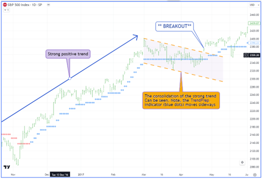
The graph above represents a simple flag pattern. It is easy to see why it is name ‘flag.’ As stated, it will normally constitute a parallel channel which follows a trending period. In the above instance, the TrendPrep indicator (blue and red dots) may move sideways at this time, demonstrating the decreased volatility and directional movement. As with all channels, the ‘Breakout’ is the point when the structure is breached. As a volatility sensitive indicator, the TrendPrep indicator is useful to detect volatility changes when it is moving laterally (See the TrendPrep indicator sections). Next, the PENNANT.
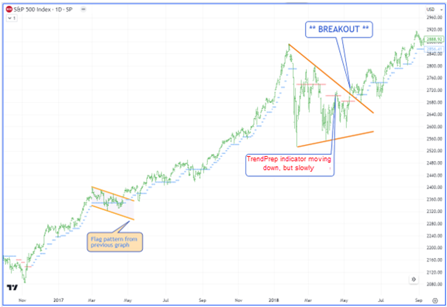
Again, it is not difficult to understand the naming of this pattern. A strong positive trend (blue dots) is replaced by a sudden jolt of volatility. The TrendPrep indicator moves down in a series of three extended plateaus (red dots). This is typical of the conditions required for the formation of a pennant. The pattern itself forms as the volatility gradually dwindles and ‘support’ and ‘resistance’ lines are drawn to identify it. Once the lines are breached at the breakout point, the trend continues in its original direction on this occasion.
It is important to note that, in both above examples, the TrendPrep indicator has been able to help identify that a change in data circumstances is underway, preparing those who trade visually, or use technical analysis as part of their investment process to identify potential upcoming opportunities.
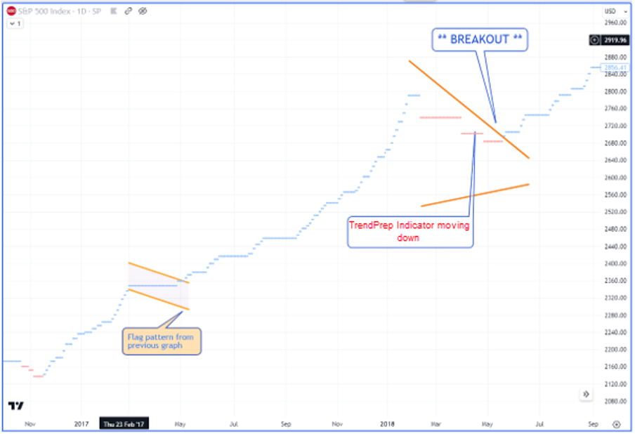
Sometimes, deleting the price data helps to see the detail and patterns more clearly. If you have a platform which allows this, it is worth doing this when things might not seem as clear as you might like.
More about Channels - Regression
The Flag and Pennant patterns are just channels of a sort. They follow trending situations and are often short term in nature. Sometimes, market trends may not be so well defined, and channels can help to clarify the boundaries of the current trend. Most market data platforms will have the ability to easily draw regression trends which can be marginally adjusted as time progresses. These are simply another type of channel defining trend. A couple of examples below feature the S&P 500 index through 2023. As you will see, the latter part of the first graph below has been in a wide-ranging upward trend, as emphasized by the TrendPrep indicator changing direction with regularity (blue to red, and vice versa). Perfect conditions for a channel.
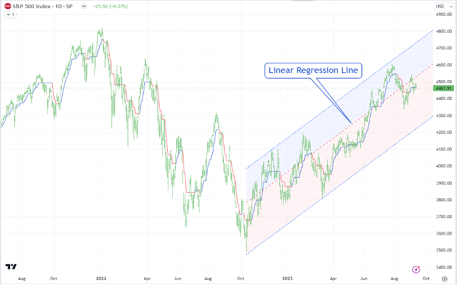
In this example, the linear regression channel has been drawn from the lowest point of the uptrend and continued through successive peaks. As time progresses, the ‘boundaries’ of the channel become clearer and can be adjusted by altering standard deviation percentages to ensure at least one point of the channel is touched on either side. When the price eventually breaks through the channel against the trend, the new direction is set. Again, this can be confirmed and monitored in lower time frames where necessary.
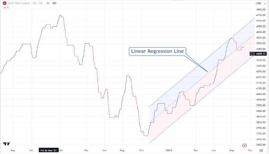
If we strip out the price data and use the same principal, it is possible to create similar regression channels around the TrendPrep indicator levels, as above. As the channel is facing up, it is now possible to monitor it for future downside breaks. Once again, channels serve as a complimentary timing aid but can also be effective on a standalone basis.
Channels and Divergence
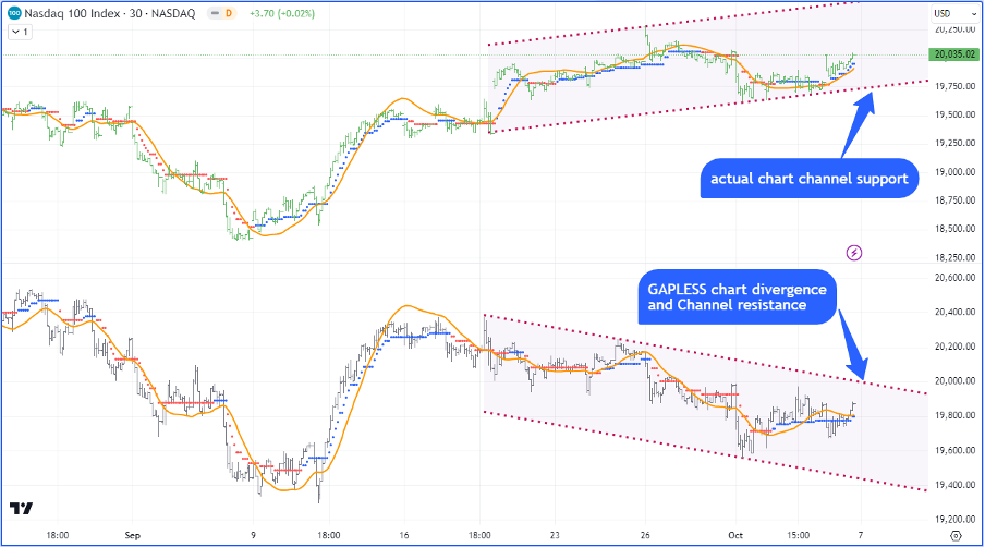
The above graph demonstrates another type of channel using the concept of divergence. Divergence is often used with standard indicators and the basic thought process is that, if the upper graph (actual price) is heading in one direction, while the lower graph is heading in another direction, then there is a divergence which may signal an upcoming change, possibly directional or an uptick in volatility.
This particular graph shows 2 channels on a 30-minute bar graph. Again, the upper channel is the actual index price, while the lower graph is a ‘gapless’ graph of the price data. In other words, any gap which has formed between the previous days close, and the next days opening is excluded from the data. The subsequent graph is then drawn which, in this instance reveals that although the price is rising (upper) the actual intraday trading tells a different story of weakness with the channels on a downward trajectory. A break below the bottom channel of the upper channel may point to weakness, whereas the opposite is true of the lower graph channel (Gapless). Where such channels move towards each other, this is ‘convergence’ and similar logic may apply.