
DEFINING A TREND
The simplest way to define a trend when using price alone is to take a positive stance (Long) when the closing price is above a moving average and a negative stance (short) when below. Like before, the version of the 2-period RSI Strategy we used applies to a ‘long only’ system tested on the S&P 500 index i.e. It will only take long trades when the index is above its long-term average. It is a system with some merit as previously alluded to, so let us look at the basic trend components.
The rules for the Long Only system are as follows ……...
1) The closing price must be > 200 day moving average. This is to trade in the general direction of the trend.
2) The 2-period RSI must have a reading below 10 i.e., buying at a short term ‘extremely oversold’ level.
3) The trade can be closed when the close > 5 day moving average.
At this point, there are a couple of things worth mentioning. The first is that the ‘long only’ version is used as the testing period from 2007 onwards is characterised by extreme bullishness. There have, of course, been substantial and rapid corrections, but the bulk can be described as a low volatility, persistent upward trend. A perfect environment for testing long strategies. Next, the use of the 200-day average as a base for taking trades, ensures that this ‘upward trend’ is used to the full as the moves above the trend presented huge historical opportunities for gain. Let us look at the above in a little more detail.
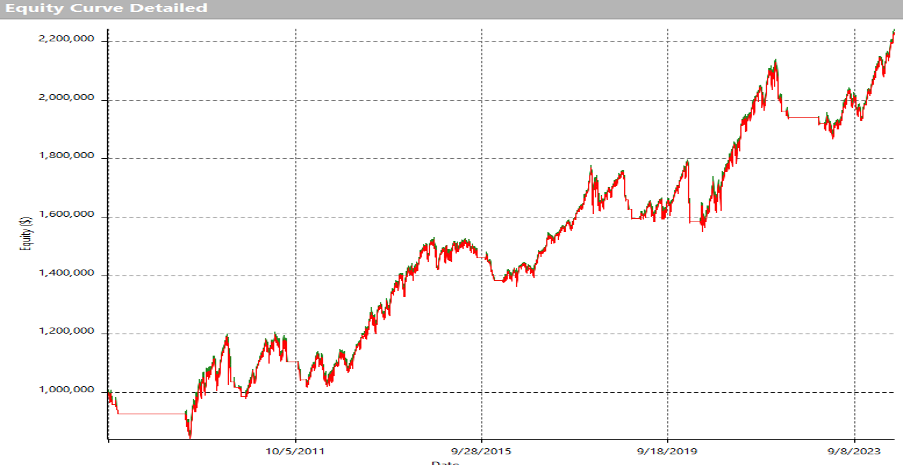
The above graph is a pictorial representation of the return achieved by ‘buying’ the index above the 200-day moving average and exiting the trade when the price dips below. It is a remarkably simple system. Although it does not look too bad, there are plenty of double-digit percentage declines which would be worrisome at the very least. Nonetheless, the trajectory is positive and, with selective timing applied within the trend, positive results are achievable.
If this were a strategy where ‘long / short’ trades were taken (Short trades taken below the moving average too) the view would be quite different.
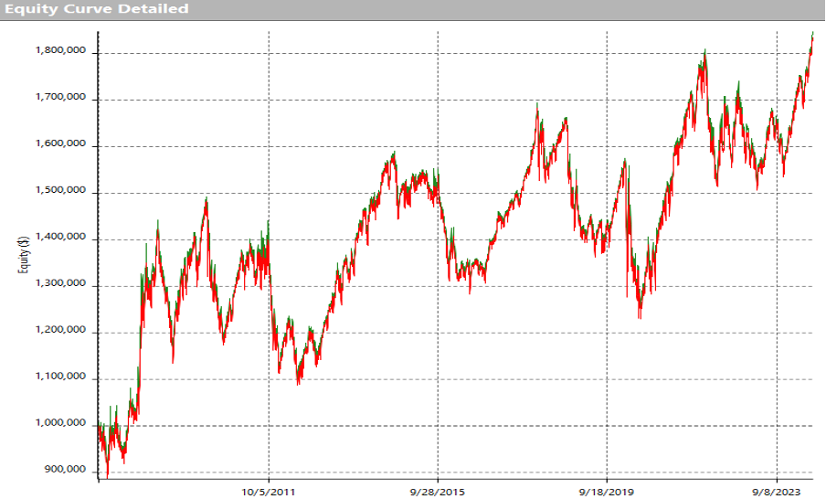
This is the equity curve when buying above the moving average and selling short below. Although the trajectory is again generally positive, it is certainly a rough ride. To this end, this has too many limitations to be relied upon. Something more robust, which can be used for both long and short sides and has historical validity is desirable, even when the underlying data has a strong directional bias.
One valid question which may be asked is ‘why not use a different length of moving average to potentially improve the outcome’? – Looking for the optimal parameter in this instance suggests that ’82-day’ is the best moving average fit in terms of return, and therefore may represent the best solution as a filter. The graph below shows that, although the result may be better, it is hardly inspiring.
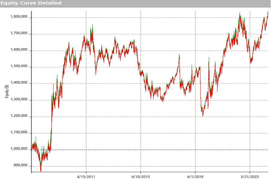
Visually okay, but not good enough might be a conclusion in this instance. Optimising parameters in this way can be extremely useful and there is a lot of available online literature available on this topic, however, our standpoint is that it should really be used for minor enhancement rather than to seek a positive outcome which may be a statistical outlier. There will always be optimal or sub-optimal solutions to any statistical series of outcomes. Although something may be optimal now, it may be less effective going forward. Some may use ‘walk forward’ optimisation (splitting the data into smaller periods, optimising the data segments, and using the resulting solutions to trade for brief time periods before repeating the process) – Whether it works or not is dependent on too many variables for this discussion, so I suggest these simple benchmarks.
- Only use optimisation where most outcomes are positive.
- Alter parameters from the ‘optimal’ solution to assess the impact of such changes to the result e.g., changing moving average lengths marginally to see if profitability is drastically affected.
- Think of optimisation a refinement tool, not necessarily a solution tool. A little like an eye test, minor adjustments may help focus and that is all that should be required.
What may have been optimal in the past may not be the best solution in the future. Any successful strategy that is designed on historical data is, in essence, at least partially optimal to the data it has been applied to, whether intentional or not. This is another reason visual validation should be used as a complimentary process.
The next sections will cover the TrendPrep strategies used in the members area, and general information covering their basic structures.
TRENDPREP – BASIC TREND
As an alternative to the often-used standard moving average type trend direction filter, our statistical back tests use our ‘Basic Trend Indicator’ for a similar purpose. It is a market timing strategy with long and short triggers which is then simply changed into an indicator format and can be used as a directional filter. Without going into the logic in full detail, 3 versions of the TrendPrep indicator are used to validate direction. See the graphs below.
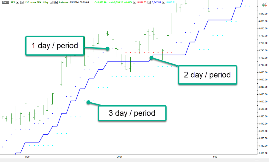
There are 3 lines represented in the graphs above and below. These are the same indicator (TrendPrep indicator) with one simple difference. The indicator represents a single day reading for the darker dotted line, a 2-day reading for the solid line and a 3-day reading for the lighter blue dotted line. The volatility setting is identical for all.
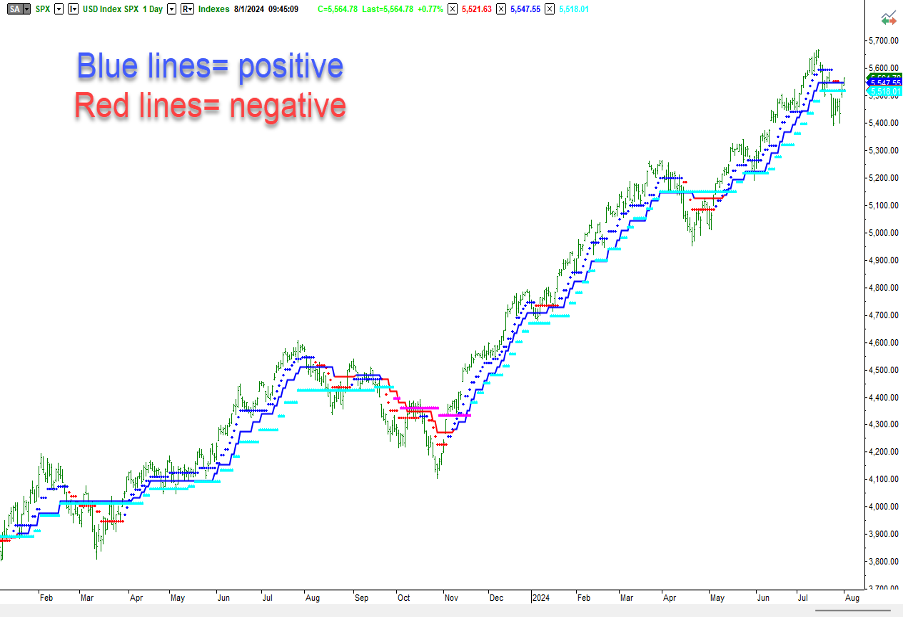
If we assign a value of ‘1’ to each blue line and a value of ‘-1’ to each red line and then add them together at each bar (Maximum of ‘3’ and minimum ‘-3’), positive values indicate a positive trend (2 or more blue lines), while negative values represent a negative trend (2 or more red lines). As an exercise, look through the graph above and you will see that this logic is quite robust from a visual perspective. To improve it, parameters can be changed or even optimized to find a more favorable solution. Although this is simplistic, and the eventual logic has more complexity, this is a strong starting point for trend recognition.
On occasion, we will use this visual in our technical overviews to emphasize trend direction and strength, but for now, focusing on the Basic Trend Indicator, we can see what is statistically achievable when using similar core logic, but with some proprietary additions.
For the members area, ‘Basic Trend’ logic will be applied to both the S&P 500 and Nasdaq Index daily in both a ‘Single’ and ‘Composite’ format. The daily values will be flagged, indicating current directional changes based on historical testing. The ‘Single’ version is literally where the logic is applied once to the data and, as a result, simply defines positive and negative readings. The ‘Composite’ reading is where the same logic is applied to the same data multiple times but using different parameters. When applied, the daily reading shows a percentage increase or decrease. This can be used partly as a ‘degree of conviction’ measure i.e., strength of signal, or indeed as a money management tool. Please see the graph below.
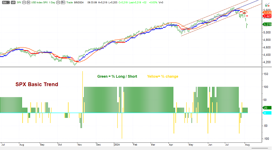
This graph is split into two parts. The upper section shows the price with the TrendPrep indicator and TrendPrep average add to the price series, as seen in earlier pages. The lower part is a graphic view in indicator form of the Basic Trend Composite values when stated as a percentage and applied to the S&P 500 index. The Maximum is 100%, while the minimum is -100%. The values are represented by the green histogram, while the yellow bars represent the change on the day.
As you can see from the graph, the values reached +100% over most of the duration of the 2 latter positive upward trends, indicating full ‘trend conviction’ or, if used as a money management gauge, potentially full investment throughout this period.
The next section will touch upon some short-term trading strategies to exploit this ‘Basic Trend’ logic to advantageous effect. However, to finalize this this section, please view the graph below which shows the back tested performance (versus the S&P 500) of the logic when used as a strategy. Comparing this to the previous RSI based logic will demonstrate a greater solidity, stability, and framework from which to build more robust timing capability.
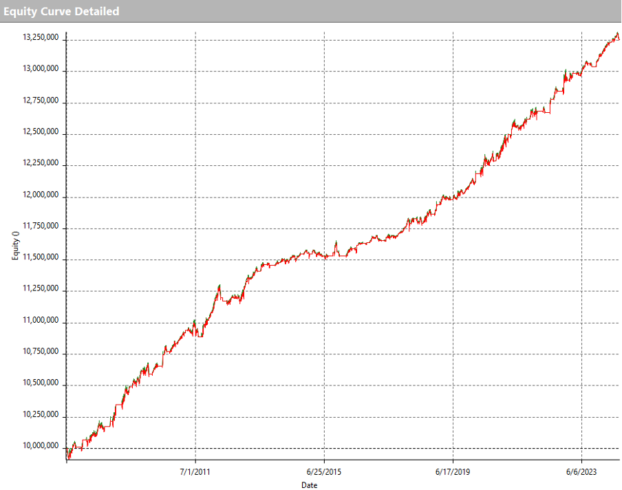
This equity curve is far superior to the 200-day moving average discussed earlier and lays a firm foundation to use as either a filter for shorter term strategies, or indeed as a standalone timing module. When coupled with our technical views (using the TrendPrep Indicator and TrendPrep Averages) this can additionally help to observe any potential changes from the historical patterns.